I mentioned in a previous post that people who are able to visualize complex information are normally and rightly given credit. Harry Beck, Ivan Kozik, Massimo Vignelli etc...
However after writing about the work of Sebastian Van Sande and Ivan Kozik and their Facebook visualizers, I began to question the reason for such systems. After all, do we really need to a graphic representation of our social networks?
Where can I, as a post-graduate researcher, draw the line when it comes to a purposeful visualization (a subway map) and and a seemingly pointless one?
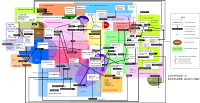
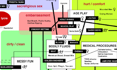
And then I found this map by Katherine Gates.
The Fetish Roadmap is a an overview and field guide to fetishes. The map provides overviews of general categories and descriptions of the sub-categories. The map is particularly well designed in that it depends on the viewers subjective point of view to understand and unravel the complexity of the information.
I'm beginning to connect with what Livett (co-author of Freakonomics; see below) says differently. There is so much "information" (data) around us and as the world grows, more information comes to fruition. Levitt has proved that by looking at information, in his case "data", differently, we can begin to see our world in a completely new way and understand the true roots of problems.
Visualization is merely a tool for "seeing this new information in a new way," allowing us to think about new everyday things such as social networks differently.
No comments:
Post a Comment