Friday, April 10, 2009

i've moved!

After almost a year using blogger, having endless problems, I've decided to jump ship to wordpress!


Thursday, March 12, 2009

back of a digital napkin

SketchCast is based on an old principle: the improvised drawing on the back of a napkin in a bar, to sketch ideas and thoughts on paper to get a concept across another person. The website presents a new way to communicate "something" online by recording a sketch, with the option to overlay the animation with a voice or speech. Any sketch can be embedded on a blog or home page for later playback.


Can this be used as a storytelling method for designers? Or indeed, can it be used by users to communicate their ideas with designers?


Tuesday, March 3, 2009

unawareness to evolution

Introductions to new things, such as enhancements in technology, by chance, often deliver a more lasting memory or experience. 

I get, what I can only call "realization" moments when I haphazardly stumble upon something new.

When I saw this image, I had one of those moments.


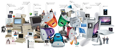
Wired have revealed a wonderful visual timeline showing the evolution of Apple products. 

Although I am aware of Apple's history and their legacy of products and services, this visualization made me realize not only how they have progressed over the past 25 years, but also how quickly.

This needn't apply solely to Apple. This image is testament to a changing world.

Context and cohesion: How can timelines be used as a communication visualization? What can they show? Can a storyboard be defined as a form of storyboard? 


Monday, March 2, 2009

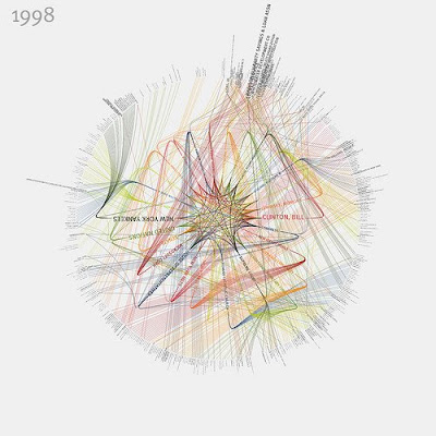
NY Times Visualizations

Visualizations that represent the people and organizations most mentioned in New York Times articles from 1984-2009 have been created by Jer Thorp. The visualizations show connections between the people and therefore relationships between them all.


twitter story

This communicates Twitter beautifully.

The simple hand-drawn graphics really reflect the simplicity and practicality of Twitter.


How can this method of story telling be used to communicate more complex information?

Follow me on Twitter: twitter.com/giorgio_giove


Tuesday, February 24, 2009

andiamo a Berlino...


Tomorrow I make my first visit to the city of Berlin!


Me and the T3 team will present our 'work in progress' to Rosan Chow and her colleagues at Deutsche Telekom Laboratories on Thursday, and we will return on Friday.

Only a short trip, but I'm ready for a wonderful journey into the world of design research on foreign soil nonetheless.


Saturday, February 21, 2009

iBirth

Having already covered iphone "romance" I had to post this... (from macrumors.com)


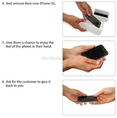
"...the process that iPhone sales folks are instructed to follow verrrry closely mimics - wait for it - childbirth. The uncanny point of similarity is that, in between purchase and the required in-store activation, the salesperson is instructed to "give them a chance to enjoy the feel of the phone in their hand," and then "ask for the customer to give it back to you." It's just like that first quick cuddle that the new mother is allowed with her child, before the kid's taken back for a thorough cleaning. And hey, why not? The iPhone is, for lack of a better term, an "intimate" product that's meant to be held and which will be an important part of its new owner's life. Without first letting the customer "enjoy the feel" of it, there might be detachment issues, postpartum depression... and I'm only half kidding, here. It's insightful of Apple to have provided this experience for the customer, a very user-friendly one that they can add to their repertoire of user-experience competitive advantages..."

This makes me think about the work by Richard Banks where he looks at what it means to design digital artifacts with longer time spans in mind, and taking heredity of objects into account. Apple have obviously considered the birth of the product with the iPhone, but how have they planned the funeral of it? 

Will the grip-reaper of digital products touch each iPhone at the end of its life; cracking the screens and malfunctioning the software? Or will the iPhone live on beyond its owner to entertain and serve a new generation?

Will the iPhone ever be "retro"? 


Friday, February 20, 2009

visualizing networks

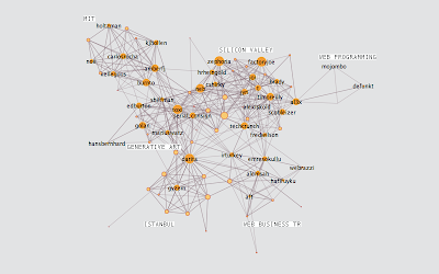
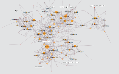
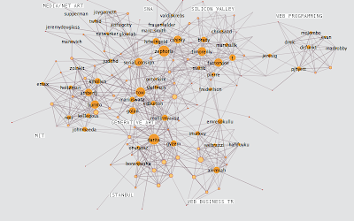
Going back to my research into visualizing complex information; Burak Arikan, artist and researcher, studies the way people interact through communication.

This following piece of work is wonderful. He carried out an experiment with the Twitter API where he analyzed the growth of his own network over a period of 3 weeks.

week 1

It appears he was trying to figure out how connections might evolve and expand (or indeed contract) over time.

The above image (from his blog) shows his Twitter network during the start of the first week of his experiment. He mapped the connections between his friends and then broke people into 6 groups.

The next images show weeks 2 and 3:


Do people mind about these diagrams? It may reveal a lot about their privacy, which is potentially dangerous when you consider all the data is public.

I was thinking about carrying out a similar experiment with people within a work environment for the benefit of my research. Who talks to who in the office? In which way do they communicate (email, in person at the water cooler, telephone)? 

Communication can be a problem in the office. Bottlenecks can be created; It is also known for people to communicate through email, even although they sit next to one another. 

Where can ubiquitous computing come into all this? Can there be an invisible communication tool in the work place that can seamlessly fit into the daily rituals and lives of the employees?

It is naive and simplistic to consider ubiquitous computers will be adopted by people in any scenario. It's all about designing around the people.


Thursday, February 19, 2009

livescribe

Amazing IC product, livescribe.


Here's a quick demonstration by IIT Institute of Design professor Tom MacTavish, of the Livescribe digital writing system, a pen-and-paper duo that records audio, remembers what was being said while you were taking notes, and affords some basic computing function in a wholly analog format. If that sounds confusing, just check out the video; MacTavish does a great job of showing it off.


richard harper

The down side to drafting into a word processing document and then copying/pasting into my blog is that sometimes I forget to actually copy and past into my blog! This following post has been sitting dormant in my computers hard drive... until now.

"
Professor Richard Harper from Microsoft Research, Cambridge, spent a morning with us to discuss how people of various disciplines see the world we live, and how this can cause problems in the design process.

He began by talking about how we gossip and how this act can be translated through metaphor into solutions for design problems.

I found this notion very refreshing as it coincides with work I have done in the past on touch-screen systems. My ideas for interactions were all based on human gestures I took as metaphors and used to act as inputs for computer systems. Richard calls this language (or method?) "Human Acts."

Richard's advice was to be aware of the difference between ourselves (designers) and others, such as scientists for example. Designers show their portfolios to other designers but seldom do they communicate their work from people outside of our discipline. He suggested we must have trust in other people and don't show them only the finished article. The process behind the finished article is often more interesting; so is communication of design all about telling a story rather than showing an artifact?

I agree with Richard. Whilst exhibiting my honours project work at the Degree Show and then New Designers, people were more interested in how the project materialized over time and why I made the decisions I did throughout the process. This was, at the time, a little disheartening in a way as I wanted people to be in awe over the prototype that I spent so long getting right. Instead, all they wanted to do was to ask questions and, I suppose, understand me rather than what I made. All I had to do was tell my story.
Richard Banks' advice is not to get to precious about prototyping; and this is probably the most valuable piece of wisdom I've taken on board since I started my Masters.

After spending an hour or so with Richard Harper, we were lucky enough to be invited to his evening lecture, entitles "Changing Humans." Here, he explained how the designers of computers and computer systems have changed their visions of users.

People love to gossip and communicate with each other. People network themselves naturally and now also digitally, through the introduction of text messaging and video messaging (and subsequently social networking sites like Facebook). The metaphor of gossiping is what inspired ideas such as video messaging; a tool that enables people to send friends videos, presumably to make them laugh.

The morning session and evening lecture made me think about a lot of things to do with common languages between people in different disciplines and interaction design in general. But the most valuable theory I took from today is all to do with language. Language is the key tool that we can use to communicate and be understood as designers. We can achieve this by applying metaphors and other language sub-tools. Language is the only common ground we all have.

"


Wednesday, February 18, 2009
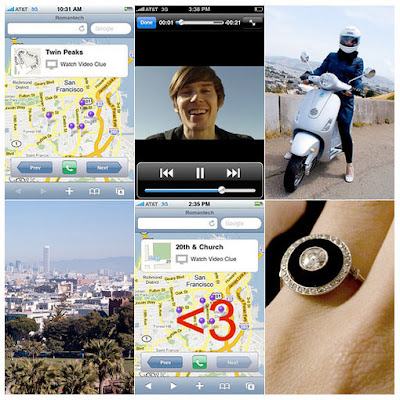
how romantech

An example of personal technology?

User interface designer Bryan Haggerty, programmer at LinkeIn, proposed to his girlfriend Jeannie Choe, former writer at Core77, with an iPhone application which he deigned himself.

It was last week that he popped the big question, but only after having his girlfriend guided through a route in San Francisco by the iPhone app. 

The app, which Haggerty calls "Romantech", displays a map containing location points throughout San Francisco. Each of the points in the map were tagged with a short video clip of Haggerty giving little clues of where Choe should travel to next. 


After a while, both met in a Park where all the points on the map connected to form the shape of a <3>

(The <3 is a heart symbol for those of you who don't know the lingo)>


Thursday, February 12, 2009

interactive comics and biological consideration

Dead On Arrival is an interactive comic loosely based on the story of the old 1940s film noir. 

Although I found this story rather dull, indolent and unexciting, the story was delivered clearly and the Flash interaction was well executed. This makes me think about communicating ideas to people through storyboards and story telling. 

I discussed with my study advisor, Dr Shaleph O'Neil about how people may react to certain storyboards. There will be 3 different types of storyboard: 1. Hand drawn 2. Graphically illustrated  and 3. Interactive.

The interactive storyboard will obviously be digital, however as Dead On Arrival shows, Flash animations can contain very "un-digital" and natural interactions. For example the turning of pages; this is done by clicking the top or bottom corners of a page and dragging them over, almost as you would do a book.

Computer interactions can be very natural. This reminds of the beauty of the interaction design of an iPhone or iPod Touch when zooming in and out of photos or web pages. Pinching your fore-finger and thumb together, a natural human gesture for describing the reduction in size of an object, is how to zoom out (i.e. to make smaller), and vice-versa.

How natural can I design interactions?

I don't mean to compare an iPhone with a digital comic, however the principle of their interactions are comparable in terms of natural gesture. There is biological consideration into their design. 

Click here to see the Dead on Arrival comic. An HTML version of the comic is also available, which I think is rather pointless. The whole beauty of the story is the interaction itself.

Tuesday, February 10, 2009

daily routines

I don't know why I hadn't blogged this weeks ago! It came up in conversation yesterday and reminded me.

Daily Routines are taken from magazines, websites, books and newspapers and depict how writers, artists and many other interesting people live their days with the little rituals that make each and every one of us that little bit different. 

The chronological blog entries allow you to compare different people from the same discipline; authors for example. 

Two of my favourite authors' daily routines are mentioned on the blog:

Stephen King

“There are certain things I do if I sit down to write,” he said. “I have a glass of water or a cup of tea. There’s a certain time I sit down, from 8:00 to 8:30, somewhere within that half hour every morning,” he explained. “I have my vitamin pill and my music, sit in the same seat, and the papers are all arranged in the same places. The cumulative purpose of doing these things the same way every day seems to be a way of saying to the mind, you’re going to be dreaming soon.

“It’s not any different than a bedtime routine,” he continued. “Do you go to bed a different way every night? Is there a certain side you sleep on? I mean I brush my teeth, I wash my hands. Why would anybody wash their hands before they go to bed? I don’t know. And the pillows are supposed to be pointed a certain way. The open side of the pillowcase is supposed to be pointed in toward the other side of the bed. I don’t know why.”


John Grisham

When he first started writing, Grisham says, he had "these little rituals that were silly and brutal but very important."

"The alarm clock would go off at 5, and I'd jump in the shower. My office was 5 minutes away. And I had to be at my desk, at my office, with the first cup of coffee, a legal pad and write the first word at 5:30, five days a week."

His goal: to write a page every day. Sometimes that would take 10 minutes, sometimes an hour; ofttimes he would write for two hours before he had to turn to his job as a lawyer, which he never especially enjoyed. In the Mississippi Legislature, there were "enormous amounts of wasted time" that would give him the opportunity to write.

"So I was very disciplined about it," he says, then quickly concedes he doesn't have such discipline now: "I don't have to."


I wouldn't have thought Grisham was so meticulous in his creative process, however considering he was a lawyer, this now seems reasoned. I also love the fact that King, writer of such beautifully horrifying stories, writes in such a pleasant, organised and warm environment. 

I think I might storyboard some of these!

Monday, February 9, 2009

hypercomics


In reference to the concept of hypertext fiction, where narrative is non-linear and non-hierarchical, hypercomics are a variation of comics that has truly embraced its digital medium, allowing multiple changeable paths within a fractured rhizomatic (wiki) environment. 

A great example of hypercomics is a piece by Daniel Merlin Goodbrey entitled PoCom-UK-001. It was originally a massive collaborative hypercomic, however this web adaptation marked the debut of Daniel's "Tarquin Engine", a flash-based interactive canvas, which allows other authors to easily explore the concept of hypercomics.

Having spoken to my study advisor, Dr Shaleph O'Neil, about using Flash to animate storyboards, I instantly and naturally created an image in my head of how this animation/interaction would look. Having seen this, however, I now realize the true potential for variation interactive visualizations can possess. 


See more at http://e-merl.com/pocom.htm


death, inheritance and heirlooms


I had an interesting conversation with Richard Banks today over lunch.

Richard has been looking at what it means to design digital artifacts with longer time spans in mind, and taking heredity of objects into account. He explained his interest in the design of a form of technology which he refers to as technology heirlooms. 

In my understanding, a technology heirloom is a technological product/object that is designed with the intention that it might live longer than its owner and therefore be "handed down"  embodying an impression or sense of its owner. (Richard, please correct me if I am wrong!)


Digital objects are normally thought of in the short term. But Richard is now asking what happens when we consider these objects in the long term that may have unpredictable and unexpected value to our children and families. 

I find this notion of digital objects being un-obsolete (have I just made up a new word?) fascinating. If I were to pass my iPod down to one of my grandchildren, how will they perceive it? Will they keep it in a shoe box under the bed as they feel obliged to keep it but not to use it? Will my (varied) music collection be loved or hated? Will my iPod still be "cool"?

What will "retro" designed object look like in 2109?


Death is something we all experience whether it be through bereavement or through the approach of death itself; it is part of life. Considering digital products may outlive their owners introduces a whole new principle in the way we design objects themselves; design for the dead?

Which leads me to think: Who will I pass my Facebook profile onto?


catch up

I identified the problem of communication of ideas in the design process to users (I don’t like using this word as it suggests a stereotype of certain people).

Communicating and prototyping ideas of interactions or, more complexly, of ubiquitous computing can be difficult and very time consuming.

But what is the value of prototyping? Is this immeasurable?

Richard Banks mentioned at his talk to IPD in November that a mistake would be to “get precious” about your prototyping. Rather than spending time on a final, well-finished product, it is often more rewarding and efficient to work through ideas quickly and communicating them as unfinished ideas as opposed to finished ones. Besides, most people are more interested in the process of a design rather than the outcome.

With Fable, I spent a lot of time neglecting people and working on making it work. Surely it should be the opposite?

However I did find it extremely difficult to communicate the ideas of ubiquitous computing to people during the project. When you tell someone a mug can be an input device to a smart-surface table, the immediate questions are always: why and how!

My initial aim, as discussed with Richard in August, was to develop tools and techniques to help designers communicate complex ideas within the interaction/ubiquitous computing design paradigm. Yet after some preliminary research, I have become clear that this is not necessary.

There already exists tools in which can be used to communicate and visualise ideas, such as storyboarding and paper-prototyping. I mean whatever happened to good old-fashioned drawing? Then there are animation software’s such as Flash which can be used to bring drawings and storyboards to life by applying movements, changes and communicating cause and effect.

“Faking” is also an unwritten method. A wonderful example being the Sketch-a-Move video by Anib Jane where she communicates the idea of controlling the behaviour of a toy car by drawing a path on its roof. No fancy electronics or computer programs, just smoke and mirrors (well, in this case a few magnets).

So I aim to put these traditional tools to the test and use them in new ways.

This happens to blend in nicely with another project I’m working on at the moment; the T3 project.

T3 (Transferability 3) is a joint research project between Deutsche Telekom Laboratories (t-labs), Berlin and the School of Design University of Dundee, exploring case transfer as a method to develop new designs for information communication products and services for older people.

Although only 2 weeks old, the project overlaps with some of the work I am doing in that it is very people-centered yet probably more demographically focused. “Older people” are seen to be 60 and over (still a huge demographic; there are more “older people” than ever before and this trend continues to rise).

Wednesday, February 4, 2009

Still Frames

It's been a (quick) month since my last post. I think I'm getting lazy.

Having spoken to my study advisor, Dr Shaleph O'Neil, on Monday, I remembered a short film I made last year. 

I took a series of photos (one every 5 minutes or so) from the exact same position when we were building our stand at New Designers 08 in London. 


An interesting way to approach visual communication of a process. Still framing could be used to communicate interaction design concepts? No fancy/expensive equipment needed; cheap tripod, digital stills camera. No script or thorough planning required.

Saturday, January 3, 2009

unique perception

Notes to self:

Can
storyboards be produced using images alone; without the use of written language?

Roland Barthes in his essay "Rhetoric of the Image" (cir. 1964) argues that the meaning of an image is always related to and dependent on verbal text. He believes that images alone are "polysemous." In other words, too open for interpretation.

Does written language always have to rescue an image?

The definition of 'comics' suggests that written language is not necessary to accompany an image or sequence of images. (For sure, a comic and a storyboard are not the same form of visual communication, however they do have their similarities).

A visualization can be interpreted in different ways depending on the opinion/stand-point of the viewer. 'Similar Diversity' (below) is a wonderful example of this.

But isn't that the beauty of visual arts? Our eyes see the same things our minds interpret things differently. 

Tuesday, December 30, 2008

so to sum up...

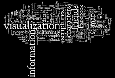
To recapitulate my research over the past semester of my MDes, I feel almost obliged to visualize it! 

I planned on writing a quick program in Processing that would randomly pick words from my blog and display them on an 8x5 sized postcard, and then I realised how pointlessly time consuming that would. I almost forgot about Wordle!

I don't know what I like best this; "information" which happens to represent a tree trunk, or the most important word of all, visualization, which sits proudly in the epicenter of my thoughts. 


Happy New Year!


religion, meet science


Philipp Steinweber and Andreas Koller have created Similar Diversity, a visualization that exposes a fresh perspective on the topic of religion and faith.

The graphic focuses on the Holy Books of five religions from around the world, showing communalities and differences between them.

The essence of the visualization is an objective and honest “text analysis” of the five scriptures without any manipulation from Steinweber or Koller, which are realized with 2 different tools; the evaluation is done using VVVV and the graphic visualization of the data is created in Processing.

Steinweber and Koller downloaded digital versions of English translated Holy Scriptures (Christianity, Islam, Hinduism, Buddhism and Judaism) from the internet.

The large arc visual shows the 41 most frequent characters from different Holy Scriptures and their communalities. 
The characters are aligned alphabetically on the x-axis. Their names’ and the arcs’ size are calculated from their total word-count in all 5 scriptures. According to that, characters which play a big role in several scriptures are displayed larger.


Below the names can be found bar charts which are breaking down the activities of the characters in detail. The verbs are gained by filtering them out of the texts, technically each verb straight after a character’s name is taken. In case of the word order "God loves" the verb "loves" is referred to the character’s name "God". The height of the rows and the font size show the frequency of particular activities.

What I love most about Similar Diversity, aside its beauty, is the fact that neither author manipulated any of the data from the scriptures, meaning the visualization will effect people differently on an emotional level depending on their religious standpoint. It really made me think about my preconceptions of religion, and in a time of conflict between Israel and Gaza, I Similar Diversity inspired me to think about religious conflict and realize to a certain extent why such hostility remains in existence.

Monday, December 29, 2008

visualizing fetishism


I mentioned in a previous post that people who are able to visualize complex information are normally and rightly given credit. Harry Beck, Ivan Kozik, Massimo Vignelli etc...

However after writing about the work of Sebastian Van Sande and Ivan Kozik and their Facebook visualizers, I began to question the reason for such systems. After all, do we really need to a graphic representation of our social networks? 

Where can I, as a post-graduate researcher, draw the line when it comes to a purposeful visualization (a subway map) and and a seemingly pointless one? 

And then I found this map by Katherine Gates.

This is a "Fetish Roadmap" (for larger image click here). 

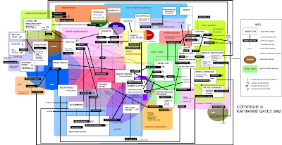
The Fetish Roadmap is a an overview and field guide to fetishes. The map provides overviews of general categories and descriptions of the sub-categories. The map is particularly well designed in that it depends on the viewers subjective point of view to understand and unravel the complexity of the information. 


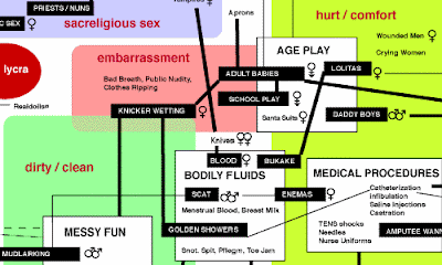
I'm beginning to connect with what Livett (co-author of Freakonomics; see below) says differently. There is so much "information" (data) around us and as the world grows, more information comes to fruition. Levitt has proved that by looking at information, in his case "data", differently, we can begin to see our world in a completely new way and understand the true roots of problems.

Visualization is merely a tool for "seeing this new information in a new way," allowing us to think about new everyday things such as social networks differently.


stop motion

This is a stunning stop motion film by Carlos Lascano. Wonderful expression of love and hope through various styles of animation. 


I particularly like the switch from 3D characters to 2D characters at 1:06 and then back to 3D at 3:00.

One of the reasons I love Vimeo!


Wednesday, December 24, 2008

visualizing friend networks

Sebastian Van Sande has developed Visualizera tool that allows you to explore your Facebook social network graphically. This is the "Visualization" of my Facebook account.

It's great as I can see friends connected to other friends and also the ones who are only connected to me. The tool allows for filtering your network by gender and relationship status.

However I'm confused as to the length of the connecting lines. What do different line lengths represent? Some of my close friends appear close to me on the map, and others far away. Does the program determine who is close and who is further away through a friends activity?

It would be even more useful if short lines represented close friends and vic-versa. This way, we would be able to visualize not only our map of friends, but also the various levels of relationships between each other. 

Imagine if we were able to connect our maps with each others! If everyone on Facebook did this then I would inevitably be connected to, say, Barrack Obama (presumably through 6 corresponding people considering the "6 degrees of separation" theory to be accurate).

Wouldn't it be great to see a whole world networked graphically using a social networking site?

As a visualization tool, Van Sande has created an interactive application that communicates a complex network greatly. As with the underground maps, credit is given to those who achieve simplistic communication of labyrinth-like infrastructures.

However in comparison to Nexus by Ivan Kozik (Below), Visualizer is lacking as both an interactive and informative tool for the search for information within a complex infrastructure. 

Nexus is another friend grapher for Facebook. It calculates friend similarity by parsing profiles, and highlights links between friends who share interests and groups. The visualization resembles a costilation and looks far more striking than Visualizer. 

And the method of retrieving information is far more straight forward. Another great example of a "walk up and use system."

Tuesday, December 23, 2008

Subway Map (Re)design


Above: The Tokyo Subway Map.

Not being fluent in Japanese, it must be said, I find this map very confusing however I assume that for a resident of Japan, it must be easy to understand. I make this assumption because the above map follows all the rules laid down by Harry Beck in 1933 and followed by Massimo Vignelli in 1972; The various lines are represented by different colours; the lines are all at 45 or 90 degrees; each station is represented by a box (rather than a circle, presumably to accommodate the form of the Japanese symbols); and the appropriate geographical liberties have been taken.

Are these the unwritten rules of railway map design?

Korean designers Kim Ji-Hwan and Jin Sol plan on redesigning underground maps from around the world starting with Tokyo, Seoul and Osaka. According to them, each cities subway and railway structures should reflect the character of that city in some way.

The above image shows the intricate network of Tokyo's subway, lightrail and monorail with over 1500 stations covering the metropolitan area.  The centre of this map has the Imperial Palace, and the subway lines circumvent the grounds that surround (are claimed by) it. This characteristic is visualized in this map by the concentric circles spreading outwards through the city. This representation of circles is suggestive of the Japanese national flag and the subsequent Japanese identity expressed in the flag. 

I think it looks great, yet I can't help but wonder if a stronger suggestive visual effect could be achieved if the map was made white. I'll do a bit of photoshopping on this one I think, I'm too curious.

White background. Is this another unwritten golden rule of map visualizations? 

Monday, December 22, 2008

New York Subway (a comparison)

Further to my obsession of the London Underground, I thought it would make sense to have a look at how other underground networks from around the word have been visualized.

In 1972, Italian designer Massimo Vignelli re-designed George Solomon's New York Subway map; and I think it is a fantastic piece of work. 


All the lines are represented by different colours, and each station represented by a black dot. In contrast to the original map design, the visual problem of awkward angles of the lines was solved by making each line 45 0r 90 degrees. Although this simplifies the map immensely, an obvious number of geographical liberties had to be taken. For example the map shows Central Park as a square rather than a rectangle.

However I do not see this as a problem. The aim of any map is to provide information in a way that is simple to understand/read. Re-proportioning certain geographical aspects of the map would certainly be detrimental to this objective. 

Do you spot a resemblance in this map? 

Obviously Vignelli was inspired by Harry Beck's design of the London Underground map (1933). Beck was the one who made all lines 45 and 90 degrees; and more importantly made the map a representation of the underground infrastructure, not influenced by the geographical layout of London itself. 

This makes me think about how visualization works. Do aspects of a design/map/flow chart etc need to be neglected in order to achieve ultimate simplicity?

Saturday, December 20, 2008

Freakonomics


I thought economics was about price elasticities, interest rates and diminishing marginal utilities. Then I read Freakonomics.

Authors Levitt ("rogue" economist) and Dubner (journalist) stray far from my perceptions of economics in search for solutions for some interesting (and extremely varied) questions. How do parents of different races choose names for their children? What sort of contestants on "The Weakest Link" are most likely to be discriminated by fellow competitors? And, my personal favourite, "If crack dealers make so much money, why do they still live with their mothers?"

Not the questions I'd expect an economist to ask. Yet Levitt insists that these enigmas are fair game for any economist as their solution involves understanding how people react to incentives.

What unites all these stories is a belief that the modern world is not impenetrable, is not unknowable and unpredictable, and "if the right questions are asked" is even more intriguing than we think. All it takes is a new way of looking. Levitt shows how to see through all the clutter.

Freakonomics is about "unconventional wisdom", using the raw data of economics in imaginative ways to ask clever and diverting questions. It makes me think about my area of research in visualization in that Levitt asks a question, takes the relevant raw data of economics, processes it and then articulates his solution to the wider audience through words.

Levitt has re-designed the stereotypical boring economist. 


Friday, December 19, 2008

communicating complex (or simple) information


We have an overwhelming amount of information all around us. We can see it and we can understand it, however one of the greatest challenges for a designer is to make sense of this information.

Don't take the word "information" too literally. Bear in mind that everything around us contains an element of information for us to interpret. For example, a ball has affordance in that it sends a visual clue as to how it should be used. We know to bounce, throw or kick a ball; and we know not to eat it!

Some information is often difficult to communicate to others. This hypothesis is something I have began to expand on in my area of research for my Master of Design degree. How can designers be good "Visualization Artists?"

It has proved useful to me in the past to be able to articulate my ideas/thoughts/research to others through giving examples. For this example, I'd like to write about one of most fascinating visualizations of complex information from one of my favourite cities, London. 

The London Underground has 11 lines and 268 stations. Approximately 4.25 million people use the underground everyday. 

The sheer complexity of the infrastructure of lines and stations was simplified beautifully by Harry Beck, an engineering draughtsman, in 1933. The London Underground map a perfect example of great "visualization" as it demonstrates how complicated information (the line and station infrastructure) can be communicated in a graphic language (a map) that is both easy to understand and remember. 


Over the festive season I plan on taking a little break from my studies, but I will be keeping my mind active by reading a few books on the topic of visualization:

Kress, G (2006) Reading Images: The Grammar of Visual Language. Routledge, London.
McCloud, S (1993) Understanding Comics: The Invisible Art. Kitchen Sink Press, New York, NY.
Carroll, J (2002) Usability Engineering. Scenario-Based Development of Human-Computer Interaction. Kaufmann Publishers, San Francisco, CA.
Kim, S (2004) VizAbility: Learn to Communicate Visually. Course Technology, Boston, MA.

stick figures with body language

I found a website which is series of Stick-figure comic strips featuring humour about technology, science, mathematics and relationships. Not the most common of themes you would associate with humor.

I am interested in the actual stick figures themselves. The illustrator(s) give a wonderful insight into the personalities, moods and emotions of the stick men by the way in which they are drawn.


I love this cartoon. Besides the dialogue between the 2 characters being so randomly funny, it's the characters that make me laugh the most, just by how they are drawn. 

It makes me think about visualization, and in particular storyboards, in the design process. A picture can tell a thousand words, so they say, but in this case, a stick man can do exactly the same!

See more at xkcd.com

Sunday, November 23, 2008

ethnography study: is online time "good for kids?"


I have a Facebook account which I use now and again, and I find it very useful for keeping in touch with friends whom I may otherwise have lost contact with. It's true, if Facebook did not exist then I would have lost touch with some friends from High School, so why use this new tool as a method of communication with people I would otherwise have forgotten about? 

I suppose in a way it makes me happy to keep in touch with these people. After all, these friends from the past are tagged with many memories, some of which would have evaporated if it weren't for the occasional email from them to my Facebook homepage.

However my opinion of social networking sites is not all that of hope, happiness and reminiscence. children and teenagers are spending far too much time surfing the internet and socializing online through the likes of Facebook and MySpace. 

There are many dangers related to these past-times such as childhood obesity and the risk of meeting pedophiles disguising themselves as teenagers through the mask of the virtual world. In fact,  25% of 8-15 year olds in the UK admit to having "Facebook" friends; people they have not met in real life but have befriended through the social networking website.

However this morning I read how a study has shown that spending time on social networking sites is important for teen development. 

The report really counters my opinion and probably the stereotypical views of parents and teachers nationwide.

"They are learning the technological skills and literacy needed for the contemporary world," said Dr Mimi Ito, the reports author. 

"They are learning how to communicate online, craft a public identity, create a homepage, post links. All these things were regarded as sophisticated 10 years ago but young people today take them for granted."

The aim of the Digital Youth Project was to provide an ethnographical view of how children use social media to socialize, learn and relax. More than 800 teenagers took part in the study.

Dr Ito also says that the internet provides teenagers the opportunity to explore in their own creativity whilst providing a "hang-out" place for teenagers, rather than public places where some are perhaps likely to cause nuisance or even commit petty crimes.

This has made me realise that there are opposing advantages and disadvantages to online socializing. On one side we can argue that children are not getting out enough to exercise, for example, as they spend so much time in front of a computer screen; surfacing issues such as childhood obesity which then leads to health problems in later life. There is also the danger of children not always knowing who exactly they are talking to online. 

However the on the other side, the argument is more related to the younger generations ability to use technology and explore their creativity. 

As a designer interested in technology, it would make sense for me to now argue for the latter, however I am indecisive (for a change) and find myself swaying between both arguments. 

So here is a final thought: "Modern" learning has become very peer-based and networked, so with more teenagers now possessing technical abilities partnered with creative thinking, will this path the way for a new breed of designer?

Tuesday, November 18, 2008

evolution of design during financial turmoil


I was speaking to my 1st year students on Friday about where their research is taking them for the G2 project. A lot of the students are looking at the current financial crisis and how the coming years of financial struggle will have an effect on design.

One student has really focused in on a specific topic regarding the credit crunch and is looking at how "high-end" design will be effected however I am more curious as to how design will evolve over the next few years.

There is no doubt that the challenging economic environment is going to have a huge effect on everyone and everything related to design world wide. Economists say that with so many families in the UK in debt and negative equity, people will no longer be able to afford the luxuries we are so often used to buying.

When people stop spending, companies stop making money; simple. So in terms of products, gadgets and sophisticated developments in technology; what will we be being sold in 5 years time?

More importantly, are design and technology about to change they way they have evolved of the past decade?


I love this image (above). It illustrates just how much both design and technology have evolved over the past 20 years or so. And the image below shows how little time it takes for a designed object to become obsolete and aged. 


In an ever changing financial environment with economic restraints, in what way will the ideas, thoughts and opinions of designers have to change in order to design for people who don't have the money to spend?

Monday, November 17, 2008

child's play

I often find myself afraid of the judgment of my peers when it comes to my design work, my views and
opinions and even my comments on other peoples work. I don't know why, but as an adult, I allow peer pressure and expectation to negatively effect my innate need of expression.

Innovation and creativity are very important in my field of work as a designer, but are also especially vital in education. Teachers prepare their students for a world that is not yet created, a world that changes. And yet, so many education systems focus almost exclusively on memorization and conformity as a learning method. 

But what about the paradigm of play?

Tim Brown from IDEO, in the following video from ted.com, talks about the connection between creativity and playfulness. 


In my opinion, the 3 types of "play" (exploration, building and role play) are vital to the materialization of innovative product and service design solutions.

But don't you agree that there already exists a phenomena that enables us to be childlike in our creativity?

Mind Mapping!

A mind map is a useful method in recording a high volume of information in a way that filters the complexity and amount of information given to us, whether it be from a book or an oral presentation. It is childlike in a sense that we draw and add bright colours to mind maps to remember key points, so the idea of playfulness is evident in this method.

Childlike maturity. How about that for an oxymoron?

Introducing Ethnography

On Friday, Lauren and I introduced Ethnography to our 1st year Design Studies students; encouraging them to be visual listeners and critical thinkers. As it is important to publish our work, thoughts and ideas as designers, we also offered the students a chance to be published on our blogs. 

Lauren gave the students a quick presentation on Ethnography, referencing the work of IDEO and showing examples from Thoughtless Acts by Jane Fulton Suri. We the asked the students to go away and observe people and how they interact with the world around them, giving them 3 days to take a photo of a particular observation and write a little insight description.

AND THE WINNERS ARE... (IN NO PARTICULAR ORDER):

GAVIN BORTHWICK
 for his excellent portrayal of his critical thinking.

DOUGLAS WOOD
 for his excellent illustration of "adaptation"

Congratulations to these guys. Here are the images and insights they produced.

GAVIN


"I chose to look at the unusual tradition of using old newspaper as a wrapping/ packaging for chip shop foods.

To notice something lying infront of your eyes, is a process that can be processed in a very short period of time. Before your mind can begin analysing information, it searches for anything that stands out or seems a little more unusual than anything else. In my case, the newspaper clipping used for the packaging for a deep fried food seems almost rediculous. When the object or thought is identified, the unusualness of the item is emphasised until it cannot be taken to any further stage. As the newspaper is and has always been designed to present news and information to the reader, the connection between news and food is non existent. Although people may identify that they are recycling their paper goods and 'saving the trees', their is no reason to combine the overall idea together".


DOUGLAS

"The cooking pot. Not only a utensil for suitably cooking foodstuffs in but when next to a sink, a useful place to store cutlery waiting to be washed or if the pot is clean, a place to store clean cutlery needing to be dried and/or put away. One of the main reason why the pot is used is because there is a lack of storage space in the kitchen area for the individual to put their cutlery and other utensils. This does however make more sense than leaving forks and knives etc lying about were someone could injure themselves. Some other uses for the pot (not shown) include a helmet or hat and a low value drum (both of these are mainly practiced by children)".

Friday, November 14, 2008

week 7

Designers tell stories.


design against terrorism

These images show barricades which have been built in front of Westminster, presumably to prevent terrorists driving a vehicle filled with explosives into the Houses of Parliament. 
Could it not have been designed to look a little more pleasing on the eye?


I don't understand the purpose of this sign.

Thursday, November 13, 2008

the value of prototyping and where I went wrong

I had a conversation with Richard Banks a few months back about communicating ideas and concepts for multi-touch products. He showed me some of his ideas in the form of sketches which had a pair of hands "photoshopped" on top of the image to suggest the idea of multi-touch.

These images got me thinking about other ways to communicate my own ideas, not only for multi-touch application concepts, but for some of my other ideas for interactive products.

On Tuesday, a board of industry designers and researchers came to Dundee to answer questions from undergraduate Product Design students. Richard himself was one of the members, along with Tim Reagan and Nicolas Villar, fellow researchers from Microsoft Research in Cambridge, Anab Jain from Nokia, Bill Gaver now at Goldsmiths and Charlie Rohan from NCR, Dundee.

Above from right to left: Bill Gaver, Nicolas Villar, Anab Jain, Richard Banks, Charlie Rohan, Tim Reagan and Jon Rogers (member of staff from the UoD)

Some interesting points came up from the discussion, particularly about the relevance and value of prototyping. 

Richard said we "using our hands helps us to think" which I found very refreshing. I have often said I like to get my hands dirty when it comes to design but have of late doubted such an approach. During the Fable project, I spent around 3 months of the 7 month project prototyping the software with the immense help of my tutor Andy Law. And all I wanted to do was prove a point and the value of the concept. But was it really worth months of neglecting the people I was designing for only to produce a tangible and physical artifact which was the materialization of my research and development?

Above: an early prototype of Fable

In some ways, yes. I proved a lot of people wrong when they told me I didn't have enough time to make a fully working prototype and it meant a lot to me (and my ego) when I was able to show Fable, my creation, to the public in Dundee at my Degree Show, and London at New Designers. But as I mentioned in a recent post, people were more interested in the story of Fable itself, from my research into people right the way through the application of technology. So should I now focus on communicating the story of my work rather than the physicality of the work itself?

Tim Regan answered this question without me even having to ask. He said "When I prototype, I often use it as a way in learning new software. Don't do this! Use the materials you are comfortable with."

Why spend weeks computer programming when I am not a computer programmer? I am a communicator.

Richard's advice was to "understand the question" and "get precious [with prototypes]," giving an example of how Anab Jain communicated her "placebo" prototypes from a postgraduate project in a short video. play full film

From both Richard's and Tim's advice, I think I got halfway there with prototyping Fable. I understood the question and who I was designing for and I was very precious with my prototyping.

I just didn't use the materials I was comfortable with.

Saturday, November 8, 2008

week 6

This image is inspired by one of my students in the Design Studies class.


She is interested in the way designers differ from others. Which made me think that of course as designers, we aspire to understand people. But paradoxically, people don't understand us as designers.

So this a metaphorical illustration of how I visualize. I don't see the bigger picture, I see lots of little ones.

Tuesday, November 4, 2008

can hope defeat fear?

Tonight is the night the people of the United States of America and the rest of the world will find out who will be the next US president.

If the United States elect Barack Obama to the presidency, that event will begin a huge change in US history and culture; we will see for the first time a triumph of hope over fear.

Yet in my view, a victory for the African American is all about the man himself and not the politics. It seems almost ironic that Obama may have the power to transform the spirit of a country, without having to change the essence of its politics.

Monday, November 3, 2008

be a story teller

For Architects or product designers, communicating ideas visually can be illustrated in a number of ways depending on the designer and object being designed.
A building can be quickly sketched (above: Renzo Piano sketch) and then later generated as a scaled 3 dimensional model using CAD software.  A product design concept can be illustrated in a similar way, perhaps in a little more detail at the initial stages of a project in comparison to an architects way of working. So you see the connection between these two very different design disciplines in terms of the way they can visually communicate.


A web site can also be quickly sketched, as the above image shows.

But what about interaction design?

As an undergraduate product designer tackling Interaction Design, I suppose in a way I was (and still am) a futurist: I proved a problem existed through extensive user research; I communicated a solution to this problem; and finally brought the solution to reality and demonstrated how it would fit in to this changing world.

With FableI found it difficult to prototype my ideas quickly and efficiently. In fact, apart from a few sketchy concept videos, my only real prototype came in the form of the final prototype itself.

Which leads me to ask, is visual communication that important in Interaction Design as it is in other disciplines, such as Architecture or Product Design? What else do employers look for?

When I was in London exhibiting Fable at New Designers exhibition, most of the people who I spoke to were more interested in my process rather than the final artifact. It was almost as though Fable was a prop in the "about me" performance.

Thinking back to ND and my Degree Show, communicating the essence of Fable was a story in itself. This is what I found in my research; this is how I interpret the research; Fable is the solution to the problem; and this is how Fable works.

No marker renders, no fancy photoshop graphics and no posters explaining the concept. 

Fable has a story behind it, and as a designer, I told the story.


Tuesday, October 28, 2008

objects


I attended a design debate at the V&A in London on Friday night, where the panel of 7 speakers pitched their arguments for the best object of all time.

British artist Grayson Perry, was the first to deliver his opinion, and he chose what the Harley Davidson which is in his words "anti-design."


Although Perry argued the idea of design being about love, and that he indeed loved his Harley, I could not empathise with him. As iconic is the Harley Davidson brand, there are far more beautiful bikes out there. So if a motorcycle were to challenge for best object of all time then a Harley would not get my vote.

Comedienne Arabella Weir was next as she vulgarly presented her case for the Rigby Peller Bra.


I don't know if it was Weir's ostentatious and meaningless pitch, but again I couldn't agree with this selection. However I couldn't help but think that Weir was missing a few valuable points to help strengthen her case. For example the fact that Rigby Peller is a family run business based in London, with clients such as the Royals.

Graphic designer, ex-president of the D&AD and founder CDT, Mike Dempsey made the first real challenge for the best object of all time.

This object is sustainable and bio-degradable, strong, humble and is more than 70 years old. Made from paper pulp, it has withstood the opposition of plastic and I'm pretty sure if you look inside your fridge, you'll see one.


The egg box I think is a wonderful choice; it is the perfect product! Compact, strong and sustainable, it does exactly what we need it to do.

The second comedienne to nominate her choice was Jenny Eclair with the light bulb; another great object for which we take for granted. However Eclair's argument was a little flawed to say the least. For example she mentioned that energy efficient bulbs emit mercury! When in actual fact they simply contain mercury and only release the neurotoxin when they are broken.

Eclair was questioned on this fact by the panel and she searched the internet on her Blackberry (ironically probably the worst object of all time) to prove her point but was shamefully exposed in her misinterpretation. Entertainingly, the panel took her to town on this mistake.

Richard Wentworth again had a a humble choice in his object, the toilet bowl; 

"an emblem of our well being."

Again this is an object most of us will use everyday and is indeed an emblem of good design: it does exactly what it is designed to do, it's cheap and very straight forward to use.

Malcolm Garrett, AIG creative director, put forward slightly more obvious choices, the iPhone and the Oyster Card.

I'm beginning to get tired of writing about the iPhone, yet it continues to crop up in my life all the time. But Garrett doesn't argue that the aesthetics of the iPhone is what makes it the best object of all time, it's about the way in which we interact with it. 

"You are presented with the information you require and you actually have physical contact with this information through touch." 

To reinforce his argument, Garrett (far right in the above image) explains how the sheer complexity of the engineering and technology behind the iPhone is beautifully hidden in such a way that you don't realise just how advanced the technology is.

"It is so so easy to use. This is typical example of how technology has been used to make peoples lives easier."

Some interesting questions arose about the future of the iPhone. Grayson Perry (3rd from the left) said he has had his cell phone for over 10 years and doesn't need 3G or music on his. He asked if Garrett would have has same iPhone in a decades time.

After each panelist had an extra 30 seconds to finish their arguments, we, the audience of 60 or so, cast our votes by raising our hands.

Who do you think won? 
  1. Harley Davidson
  2. Rigby Peller
  3. The Egg Box
  4. The Light Bulb
  5. The Toilet Bowl
  6. The iPhone
 

Monday, October 27, 2008

Getting around London in 2 hours, 26 mins


It's hard to visit a city when you only have a single day to do the things you want to do, particularly in London. Yet I return home from our capital content with my trip, having seen more than what I thought I would.

I'll be honest, although I know my way around the city reasonably well, I did find myself lost on a few occasions. And as I was the event organizer for this trip, this could have been a potential embarrassment had it not been for my map.

Before you envision me leading a group of postgraduate design students through Hyde Park and Piccadilly Circus, arms spread wide apart in order to hold the massive AA map of London, I should turn your attention to what I call my "everything."

My "everything" is small, inexpensive and does, well, pretty much everything I need it to do.

Some people like to call it the iPhone.

Within a few hours of being in London and with a group of students following my lead, I found myself confused in an unfamiliar area of  between 2 tube stations and I had completely lost my bearings. So out came my "iPhone" with it's Maps application. Which is genius! It located me to the nearest 5 meters or so and then directed me to Liverpool Street tube station, a mere 5 minute walk away.

Another application for the iPhone which is free in iTunes is called Tube Status, which basically tells you if there are any delays or closures on all the London tube lines, updating you every few minutes.

My adventure in London:

The fact that I had to zoom out so much that the above map is almost unrecognizable puts emphasis on how far I managed to travel in a single day in London.  

Google Maps on my iPhone tells me that my total traveling time was "34.0 mi" which is "...– about 2 hours 24 mins."

You're probably thinking this is an inaccurate estimate, and you'd be right.

It took 2 hours 26 minutes.


Sunday, October 26, 2008

weekly image update

Week 3
I feel this image accurately illustrates how obsessed I became with my new toy in Week 3.

Week 4
Having discussed "What is a designer?" with my first year Design Studies class this in week 4, one student made an interesting point: "Designers just make things happen. We don't know why, it's just in our nature." 


Week 5
What is it that makes a designer different from anyone else? In my opinion, we are connectors: we make connections between people, technology... pretty much anything really. Our are eyes are capable of seeing the bigger picture: We see things in a completely different way.


Tuesday, October 21, 2008

being a teacher part 3

Yesterday afternoon myself, Lauren and Dr Louise Valentine introduced the first year design studies class to their new brief; the G2 project.

Lauren and I introduced the brief, Louise gave an overview of the assessment format and then we started the workshop: What is a designer?

At this stage, the inevitable happened! When posed this question to the class, there was a sea of silence. But not for too long!

One student raised his hand: "Designers find connections between people. We are visual communicators."

What a wonderful answer!


After a quick brainstorm to get them started, the students were then split into teams of around 6 or 7 and told to brainstorm further, where I was then again astonished by another students answer: "[designers are] people who care."

The session ran very smoothly. The aim was to make students have a stronger understanding of what a designer is, but during the workshop, it was clear that they were developing their own unique and formal opinions. I believe the students went home with a stronger understanding of what a designer is, with a heightened awareness into their social responsibilities and most importantly, a distinct understanding of that the assignment is about.


Tomorrow afternoon, Lauren will be running a book club for all Art and Design students at the University. I would be thrilled if one or more of our students go.

Monday, October 20, 2008

bowler hat with sleeves

On Friday afternoon, the Masters class spent some valuable time with design consultant David Townson, following his morning lecture, Bowler Hat with Sleeves.

In his lecture, David gave an overview of his inspired career going into detail about his work with Orange, service design company Live|Work, his academic experience as course director of Innovative Product Design at the University of Dundee and finally about his new adventure with his own design management consultancy, Aptide. (Apt - Idea)

"Naming a company is in a way similar to naming your baby" (Townson, 2008) 
David made some interesting points, particularly when he asked the familiar question we have all asked ourselves at some stage in our careers, "What is design?"

He quoted Richard Seymour's definition "making peoples' lives better," which is a bona fide answer. But he went on to say that design is all about making connections, and that we as designers are the connectors.

This made me think back to The Tipping Point by Malcolm Gladwell, where Gladwell describes the "three rules of epidemics" in the tipping points of epidemics. The first, The Law of the Few:

"The success of any kind of social epidemic is heavily dependent on the involvement of people with a particular and rare set of social skills." 

Gladwell describes these people as either Connectors, Mavens or Salesmen. Connectors are the people who "link is up with the world... people with a special gift for bringing the world together." So in my understanding of this concept, we as designers can change the world.

I took a lot from David's lecture including the notion of making connections between people and technology. But the most valuable point of view I took away with me was that design is about people. Often is the case that a piece of technology is designed and then designers try to find a problem to fit the solution. Hence the lecture title, Bowler Hat with Sleeves. (A quote from Billy Connolly where he tells the story of emerging useless products. The other example being a coat hanger which is also a lighter). The technology should be designed around the users' needs, not the other way around.

The morning lecture with David was delivered to us Masters students and also 2nd year Design History, Theory and Practice students. This collection of undergraduate students represent all areas of design taught at the University; Product, Jewelry, Textile, Interior and Environmental, Interactive Media and Graphic Design. 

A lecture hall filled with a huge range of design disciplines.

Yet one certain individual (a jewelry designer) decided to ask David a question which opitomises exactly the problem with a lot of designers today. "What has this got to do with Jewelry design?"

I can't understand why some designers work in their own bubble. Design is multidisciplinary. 

I graduated in Product Design yet my favourite designer is an architect. 

    Thursday, October 16, 2008

    interaction design rant

    Long gone are the days of consumer industrial design; more designers are being asked to design products and systems that incorporate interactivity. However the transition from traditional industrial design to interaction design is complicated as both disciplines are very different. Imagine asking a textile designer to design a building. Since the level of complexity increases exponentially as a product gains more digital intelligence, a new kind of expertise is needed; that of an interaction designer.

    Looking at the fundamental, and to a certain degree classic elements of “industrial” design, there is almost no consideration to anything dealing with behavior and the relationship between man and object; it’s all about the color, texture and shape. These primary rules are the basic elements of traditional industrial design education.

    Lately, "product design" education has steered industrial design programs to consider "context of use" as a core data set in guiding function and form. Even these programs tend to concentrate more on research methodologies for gaining further insights into user contexts, than in teaching the unique design foundations associated with interaction.

    So it’s fair to say that product design is changing; we are in a transitional movement where, as designers in our own right, we have the opportunity to be more than just a product, media or industrial designer. We can be a bit of all three. We can be multidisciplinary.

    Sunday, October 12, 2008

    Why do we go back to the brands that kick us in the nuts?


    This months Icon magazine features an interview with Paul Bennett, IDEO's Chief Director. 

    Bennett explains that sometimes we have to be let down by a brand not once, but a couple of times before we consider leaving it. 

    And he is right.

    I had been a faithful PC user since I was 10 years old. I stood by all the PC's I've had through countless viruses, sluggish performance, regular program crashing and the infinite use of Ctrl+Alt+Delete. Why? Because thats what I learned to live with.

    But after 12 years of being slowed down by my trusty steeds, my eyes were opened up to another operating system which couldn't catch a virus, performed excellently all the time, rarely crashed and indeed didn't have a Ctrl+Alt+Delete function; because it didn't require it.

    Mac OS X.

    The same principle of loyalty applies to my choice of mobile phone handset and network provider. 

    Although my first Sony Ericsson handset had to be sent away for repair twice in 12 months, come the end of my contract, I decided I wanted another one. And now I look back and think why I was frustrated when my second handset had similar problems and had to be sent away for repair. Orange did little to help on both occasions, only supplying me with an old replacement handset until my broken Sony Ericsson came back. 

    And then there was Orange's reception quality, which has gradually worsened over the past 2 years. Yet I still didn't complain.

    Until the iPhone was born. 

    Arguably the best piece of industrial and interaction design in cell phones mated with the UK's best network provider O2 (with the best signal coverage); the iPhone is the answer to all my problems.

    So today I bought one.


    Sometimes we don't realize that certain a product or service is a liability. We might think a broken cell phone is merely a temporary burden; you don't get a poor reception everywhere; and a slow computer may only take a bit of patience. But it is when our eyes are opened up to how much better things can be that we begin to wonder why we actually settled for inferior goods in the first place.

    Saturday, October 11, 2008

    Being a teacher part 2


    Lauren and I redesigned and rewritten the brief for the students. We added a new style and identity to the brief and other hand-outs, taking visual inspiration from the G2 supplement.

    I stole these images from Lauren's blog! I hope you don't mind!


    The students will be asked to write a 1000 word article about what design means to them.

    I would have enjoyed such a task when I was in my first year at Design School, but I can appreciate how some may see writing as a boring and tedious challenge. So one of the main teaching objectives for me is to make the students know that writing can be fun. 

    As designers we need to be critical thinkers and articulate communicators, and this doesn't come naturally to us. To form our own opinions on products or services (or anything for that matter) we first need to build a foundation of knowledge; we should immerse ourselves in the context of design by reading blogs, magazines, books, websites and journals.

    This is the message I will trying to put across to the students. I'm looking forward to seeing what they come up with.


    Friday, October 10, 2008

    week 2

    This weeks postcard was inspired by the work of Paho Mann.

    My adaptation of one of his "Junk Drawer" photos is a visual metaphor for my cluttered thoughts and ideas against my only route of clarity this week. 

    The coherence comes from two books, The Tipping Point by Malcolm Gladwell and The McDonaldization of Society by George Ritzer. 

    Why are my thoughts cluttered? I'm not really sure. Probably because there has been a lot happening this week; preparation for the Design Studies class I'm about to teach, designing the website for City Golf in Kuala Lumpur and not to mention the opportunity which has arisen to do research for a major German telecoms design team.

    Thursday, October 9, 2008

    art meets design through the middleman of ethnography

    I have observed people in lots of different ways as a designer. My last interaction design project, Fable, started off as a research project entitled Rituals in the Way We Eat (The title inspired by designer Dean Brown with his research project Rituals in the Way We Sleep). One of the most interesting pieces of research was the cross cultural comparison exercise where I asked families in the UK and Italy to take photos of there eating environments.


    I was trying to uncover as to why it means so much to Italians to spend mealtimes together as a family. Here in the UK we don't seem to care as much and only just over half of British families spend mealtimes together regularly; compared to over 90% of Italian families. The photo below shows the inside of (newly weds) Ivan and Melissa Rocca's cutlery drawer.


    But I'm not going to go into detail about the project; the purpose of this post is to show a link between design and art, in this particular example, photography.

    Photographer Paho Mann has photographed junk drawers and medicine cabinets for 8 years. His work examines the resolute mark of individuality in a culture that advocates conformity. He explains that even among people who try hard to fit into society there is an abundance of information each person reveals in "near-private" spaces, such as drawers and cabinets.

    Mann goes on to conclude that these semi-hidden spaces force people to deal with our human impulse to collect and categorize. Through doing so on a subconscious level, individuals reveal insights into their personality and identity.


    I love the way Mann has visually communicated his work, photographing all the drawers looking down against a black background. I'm not sure if there is a hidden message in this consistency. It's almost as if he is suggesting that every human has the same natural desire to collect and categorize; and the only thing that differentiates us from one another is the way in which we do it.

    Friday, October 3, 2008

    Being a teacher part 1


    Myself along with Lauren Currie are on a teaching adventure which has officially begun as of today.

    First year product and media design students will be given the following brief:

    "The Design Journal is producing a Junior Design Journal supplement to be published with this winters edition of the journal.  The theme is Design learning and Culture.  The Guardian newspaper is going to publish the best of the articles and has asked that you submit your article in a G2 layout and format."

    So in other words, our job is deliver this brief to the students and then be the awe inspiring tutors which will bring each individual out of their high school thinking shells, and see design in a new light.

    Looking back to when I was in my first year, this task (which was structured slightly differently) opened up my eyes to the world of design as being a multi-disciplined creative endeavor, underpinning every form of creation from objects such as chairs and mp3 players to the way we plan and execute our lives.

    The first meeting to discuss the teaching plan happened today in the bedroom/studio of Lauren.


    The reason for this meeting was to brainstorm ideas of how we can deliver our lessons, what tasks we can make the students do and, most importantly, how we can make these tasks exciting.

    We realize that writing isn't what students in their first few weeks of design school want to be doing, so the challenge for us will be to make them appreciate how valuable research and writing will be for them as designers, and to also make it fun.


    exciting intern opportunity

    One of the reasons I chose to do my Masters degree was because I wanted to network myself and get my name recognised. My undergraduate course gave me little help doing this.

    So 2 weeks into my MDes degree at the University of Dundee, I have an exciting intern opportunity to research and design with a European Partner. The internship, which would form a significant chunk of my Masters, involves the exploration of methods and methodologies from other areas of design which can be more successfully used and adapted as part of a design process in Service and Product Design.

    This sounds right up my street as I am a firm believer that all designers should adopt a multi-disciplined approach. There are obvious crossovers in all areas of design which should be recognised; in fact it was Christine Kingsley who opened up my eyes to service design a few years ago whilst I was studying Product Design. 3 friends from my class last year executed excellent service design honours projects, Lauren Currie with her Douceurs project; Garry Burns with Grapevine FM; and Kathleen McLaughlin with Re-Fresh.

    Furthermore, Lynsey Duncan, a 2007 graduate from the same Innovative Product Design Course, immediately after graduating landed a job with Live|Work, arguably the most most recognised Service Design company in the UK.

    The essence of Live|Work's approach to service design is summed up perfectly on their homepage:

    Most organisations agree that their services should be oriented towards the customer. Why then, does it happen so often that we have appalling experiences when we use banks, buses, health services, insurance companies and other services? Why are they not designed as well as the products we love to use such as an Apple iPod or BMW car?

    My point exactly!

    Wednesday, October 1, 2008

    week 1

    We were asked to design a postcard which best describes our first week on the Masters course. 

    As I was 4 days late (as I was at my cousins' wedding in Milan), I came up with this.

    I really love this font. It's called karabinE and can be found at dafont.com

    I'm using this font as a part of my long running project; Designing Me, where I search for the giorgio giove identity.

    We were also asked to design a poster to pin up in the studio so we can all get to know one another and get idea of what each others strengths are. Here is poster! (The colours are faded and there should be some text in the white box but this is the result of uploading).


    Tuesday, September 30, 2008

    the moment in which an idea becomes a gobal trend

    Today we (my MDes class), were given a talk by Jonathan Baldwin about a fascinating book that has helped me begin to look at design and the world in general in a different light; The Tipping Point by Malcolm Gladwell. 


    The Tipping Point, whilst applying social psychology to ‘real world' situations such as marketing, neatly explores the notion of simple cause and effect.  It demonstrates how often a seemingly irrelevant or inconsequential influence can have major unforeseen impacts upon the world. The ‘tipping point' itself is that magic moment when ideas, trends and social behaviours cross a critical threshold, and sweep through whole cultures, as Gladwell describes it; "like a virus."

    ‘The Tipping Point' discusses how Hush Puppy shoes went from selling 30,000 a year in 1993 and then "tipped" to selling to 2,000,000 a year later which took the manufacturers by surprise as there had been no change in marketing. Gladwell looks at ‘crime waves' and also the triggers, which caused a massive and dramatic drop in New York crime in the 1990s. He discusses education and what it was about Sesame Street that made learning "infectious" for young people.

    It's true what Jonathan Baldwin said about this book today; you can give a copy of it to anyone to read no matter what their background and they'd at least find it interesting. I've already recommended the book to an accountant, a psychologist, a physics student, a fine art student and my mother! 

    Anyone can relate to this book, but for any designer reading this blog, I especially recommend it to you. 

    Sharing What I Know...


    I have been asked by 2 of former tutors of mine at the University of Dundee if I would be interested in teaching 1st year Innovative Product Design and Interactive Media Design students!

    At first, I was a bit skeptical as my diary is already bulging after my first week back at design school. But after a bit of persuasion from Dr Louise Valentine and Christine Kingsley, I realised that this is a wonderful opportunity.

    So I said Yes!

    The module I will be taking, alongside my classmate and good friend Lauren Currie, is called Design Studies which forms a fundamental basis for learning to articulate thoughts and communicate through visual expression; skills which are essential to any young designer.

    I was lucky enough to be taught by Louise and Christine in my 1st and 2nd year at design school and I appreciate how valuable their lessons, projects, seminars and advice are to me as a Master of Design student. 

    So now it's me and Lauren's turn to take what we know and pass it down to the next generation of product and media designers at the University of Dundee! 

    I hope they all understand the Fife accent! 


    Tuesday, August 26, 2008

    Multi-Touch in medicine


    Germany's BrainLAB AG has installed its first Digital Lightbox radiology system in a Munich hospital. Doctors will be able navigate and zoom into X-rays, medical images and data via the enormous multi-touch screen; it's like a huge iPhone, but hopefully you won't have to wait in line for this one.

    Saturday, August 16, 2008

    Fable update...

    New Fable video...

    How long is a piece of string?


    This alarm clock by Duck Young Kong is set by pulling a string; the length of the string is representing the time remaining until the alarm goes off. I find this interesting because here the input and feedback are done through the same media - the string.


    Tuesday, August 12, 2008

    More Illustrator work...


    In this example of a VW van, I experimented with different brushes in Illustrator to trace around the image. The (unfinished) result is this!
    The next stage would be to draw in more detail including the interior and wheels, and then add colour. 
    If anyone wants to have a go at this exercise, the image is available as a vector. Contact me at giorgio.giove@googlemail.com

    More Dots....


    Inspired by the bus shelter advertisement below, I played around on Illustrator and came up with this neat little image!
    The dots appear to curve away as if formed around a cylinder adding a dynamic to a simple image.

    Monday, August 11, 2008

    Dot Rendering?


    As you may have noticed, I have a slight fascination with imagery created from physical artifacts. So continuing my fascination, this bus shelter advertisement for the Treasury Casino in Australia was made from 7563 pieces of dice.


    Thursday, August 7, 2008

    Vicente Tigre

    I love this...

    By Vicente Tigre -  Club 11 A piece from a series designed for Club 11 in Amsterdam. “I made them while working for 178 Aardige Ontwerpers in the Netherlands. The concept was to transform each club night into a scenario illustrating each DJ and the performers, according to the featured night. There are a lot of 3D elements in here.”

    Thursday, July 31, 2008

    Attigo TT by Scott Hobbs


    Final Product // ATTIGO TT from Scott Hobbs on Vimeo.

    Being an interaction designer I feel it is my duty to show this on my blog...

    This is Attigo TT by my friend Scott Hobbs. See more of this amazing product prototype at http://www.attigo.co.uk/

    Sunday, July 27, 2008

    3D Interface


    Found this on vimeo: A 3D interface made using Arduino and Processing...

    Thursday, July 24, 2008

    New Microsoft Application


    Microsoft's surface team are continuously developing new applications for the surface project. This is one I found on youtube 
    where the surface itself would actually be used in a shopping environment, in this instance a snowboarding shop.

    I hope to mock up similar applications using screen overlays (unfortunately not multi-touch compatible) and Flash. 

    I have also been playing around with Processing again. Processing (www.processing.org) is an open source programming language and environment for people who want to program images, animation, and interactions. It does things that Flash cannot but is a bit trickier to get your head around. There is no
    timeline or tools to use, just a white space where you type in the code.

    My plan over the next few weeks is to take the Fable program (written in Processing) and make it talk to Flash....

    if anyone has any ideas as to how I can do this.... let me know!

    Monday, July 21, 2008

    Shadow Typography

    Found this online earlier today.

    This is the sign for The Gallery Hotel in Florence; one of my favourite cities to which I haven't yet been!
    Bent wires are used that spell the hotels name in a shadow when it is lit by a spotlight.
    I'm guessing you'd find it difficult to find this place in the daytime!

    Wednesday, July 16, 2008

    I.D Tags


    The Fable computer program is designed to recognize the I.D tags when they are placed on the tables surface. 

    Each tag is representative for each member of the family and also the photo frame.

    The tags are made up of 2 different materials: a reflective film and mat black card.

    As the webcam is adapted to see only infrared light, the program will only see the reflected part of the I.D tag; and as the above image shows, each reflective area for each tag is different in size.

    The program basically counts the pixels of reflective area, and since each area is different, it is able to understand the difference between each tag.

    Notice the asymmetrical layout of the tags. This enables the software to understand when a mug is rotated.

    The frame works in the same way. As the following image shows, the reflective area for the frame is much larger than it is for the mugs. This means the software can easily differentiate between the frame and the mugs. The black spots on the side of the frames tag are for the software to understand the orientation of the frame so it can position a photo inside the frame and react accordingly if the frame is rotated.


    Hacking

    As I mentioned in my last post about altering the webcam to see infrared light and block out natural light; I like to hack things.

    I have an understanding of how electronic products work and how different materials can be used to replace existing parts to change a products behaviour. The story of how I made the i.d tags is an example of this.

    I started of by looking at materials which absorbed or reflected infrared light.

    Skin does this best. I built a simple touchscreen by embedding IR LED's into a sheet of acrylic. When skin comes into contact with the acrylic, it absorbs the IR light and creates a glow (or blob as it was referred to).

     
    So I began to play with various materials which I thought could react in a similar way to infrared light; such as leather and silicon. But none of the materials worked.

    Which lead me to the physics reflections: retroreflections

    Some surfaces exhibit retroreflections. The structure of these surfaces is such that light is returned in the direction from which it came. A surface can be made partially retroreflective by depositing a layer of tiny refractive spheres on it. In this case, internal reflection causes the light to be reflected back to where it originated.

    This is used to make traffic signs and registration plates on cars as the light would be reflected back to a cars headlights rather than into the drivers eyes.

    This theory is also evident in reflective jackets, such as those worn by builders or cyclists. 

    I bought some of these jackets and also bought a strip of reflective tape from 3M. The film that worked the best for my I.D tags were actually from a cyclists jacket I found in IKEA; of all places!

    So I cut the film into circular sections and stuck them onto the bottom of the mugs. 

    Tuesday, July 15, 2008

    Fable


    Fable is an interactive kitchen table designed to encourage families to spend a bit more time together at mealtimes. It allows the family to communicate their own individual experiences, stories and memories by providing each member of the family with the possibility of sharing their own photos.

    Each object on the table, in this case coffee mugs, has its own unique I.D tag. The I.D tag is representative for each member of the family and the built in computer has been pre-programmed to understand which tag belongs to who.

    When, for example, the father of the family wants to share his photos of a particular event, say from a recent business trip, he would simply email or text those photos to Fable where they would be stored. When he comes back from his trip and he sits down with his family for a meal around Fable, the father can then display his stored photos by simply placing his coffee mug on the table’s glass top surface. The photos are then displayed next to the mug as thumbnails.

    Wherever the mug is on the table, the photos will follow it and can therefore be passed around to anyone.

    How does it work?

    The prototype is made up of a number of individual elements which are part of a system. This system can scan the glass table surface, identify objects on the surface, differentiate between different objects and process the appropriate photos for each object.

    The first element is the infrared light source which sits beneath the table pointing upwards and therefore filling the entire glass surface in IR light. The source consists of an arrangement of 36 IR LED's with a 60 degree beam angle, designed to focus on the area of the glass.


    The second element is a webcam which sees the entire glass surface from below. It is positioned amongst the light source. Webcams are designed not to see IR light as they have a filter built in behind the lens which blocks all IR light getting through. This is simple to remove, and as a result, the camera can be altered to see infrared light.

    Another neat little trick  is to replace the little filter with pieces of negative camera film from a disposable camera. This will block out all natural light from the webcam effectively turning it into a infrared detector.

    The third element is the physical objects. Each object will have a unique I.D tag on its base, so when it is on the glass surface, the webcam will see it. But remember, I hacked the webcam to see only IR light so the I.D tags are actually made up of reflective film. This film reflects the IR light from the LED's back into the webcam.

    Which leads to the final element; the computer program. Written in Processing (www.processing.org), a java script application, the program is receives live video stream from what the webcam can see on the table surface. It has been pre-programmed to look for a number of I.D tags on the table. So for example when the father puts his mug down on the table, the webcam will see it, tell the computer program what it sees and the program will send photos to the mug using a projector.

    The thumbnails can travel around the perimeter of the screen on an invisible track. This leaves space in the middle of the table for salt & peppers, ketchup etc. But it also leaves space for my 2nd neat little trick; the photo frame.

    If you look at the above image, you'll notice that the thumbnails appear one on top of the other in a little cluster. The photo on the top of the cluster would be the photo the user wishes to see. To flick through the cluster, all you have to do is simply rotate the mug, which will bring a new photo to the top of the stack for every 30 degrees of rotation.

    However if you place the photo frame (and this is where it gets really clever) in the middle of the table, the thumbnail photo on the top of the cluster will appear inside the frame. This enlarged photo will follow the frame around the entire table, and again if you rotate the mug, the recurring photo on top of the cluster will be replaced inside the frame.

    video


    Rituals in the Way We Eat

    After me rambling on about the successful week I had at the New Designers exhibition in London, I think it is only appropriate that I explain what my work is.


    The Fable project began last September as a research project entitled Rituals in the Way We Eat. 

    I started off by comparing the eating habits and rituals of British and Italian families and found that only around 55% of families in the UK spend regular time together around the dinner table at meal times. In Italy, this statistic is closer to 90%, with French, German and most other EU countries close behind. 

    So why is it important to spend time together as a family at meal times?

    Child psychologist and parenting expert Dr Pat Spungin, founder of Raising Kids, says the benefits of family meals are far-reaching, often surprising and should not be underestimated.

    "There is often not a lot of two-way communication going on {between family members}," she says. "It is one-way from machines to child, either from the TV or computer. Kids need interaction to develop their language skills, babies can't learn to talk from a TV."

    This isolation can impact on children's language skills. Researchers at Harvard University concluded that family dinners were more important to a child's language development than reading or playing with them.

    But they are also important for a child's development and self esteem outside them home. A number of recent studies suggest that youngsters who regularly sit down to have family meals are less likely to indulge in pastimes associated with yob culture, such as smoking, drinking and drugs. Furthermore, they perform better at school and have fewer health problems.

    "Family meals are about bonding, they give a child confidence and teach them how to behave with others," says Spungin. "This isn't only in the home but in the outside world as well."

    Source: BBC News Magazine and mealsmatter.org

    So I identified a problem within our society and then began researching into ways it could be prevented.

    I was always aware that there could be no product or service which would completely resolve this problem. However through research I learned that encouraging a different type of interaction between a family could help lessen it, even it meant that family spending an extra few hours a week around the dinner table.

    Which leads me swiftly on to my proposed solution. 

    This solution is based on extensive research but was initially born with an observation I made whilst sitting with an Italian family for dinner one evening.

    Storytelling.

    Imagine the stereotypical scenario of the Italian family at dinner time: Dad sitting at the end of the table whilst his wife serves him and his two sons a healthy meal of pasta, fish and cheeses; all of them talking loudly to one another as if their hearing were impaired. 

    Once they all settled down, they all, as though it were rehearsed, took turns to tell a story. Whether it be about what happened at work that day, or what was on the news or what was seen out of the bus window on the way to school.

    The family performed a beautiful sharing ritual of a simple story.

    Which got me thinking...

    A product which would encourage family's to tell stories to one another at mealtimes. Fable.


    Monday, July 14, 2008

    play


    Having planned to spend another year at University to study a Masters of Design, I went to New Designers exhibition in London last week not to find a job, but to get myself recognized. 

    With 4000 fresh design graduates from all over the UK, I knew it would be difficult to attract a lot of attention to our stand at the exhibition, especially when I found out that Northumbria University had spent £10,000 on their stand. 

    However there was one aspect of our work at Dundee University Innovative Product Design that separated us from the other 3993 students:

    WE MAKE THINGS THAT WORK

    Above: My friend and fellow classmate Scott Hobbs (www.attigo.co.uk) showing off his famous Attigo TT touchscreen turntables. 

    What made our exhibit stand out from the others was the fact that people were able to interact with all of our products. We didn't have little notes next to our products reading "PLEASE DO NOT TOUCH" but in fact handed out A5 sized booklets describing each of our projects which had one word on its cover: play.

    And this is exactly what we wanted visitors to do; to pick up and play with everything.

    Above: Me having a shot of figfour by Pete Dollman. (www.figfour.co.uk)

    Although there were only 7 of us able to make it to New Designers, there was still a wide range of diversity in our work, and every visitor to our stand left a fresh new understanding of how Product Design should be.

    I would hate to sound harsh against all of the other students exhibiting their work, but a nicely polished blue foam scaled model can certainly look good, and most of them look great, but what is it that makes certain Universities at the show different from anyone else? 

    Nothing. There was a typically generic look about all the work at the exhibition. So getting yourself noticed as a product designer is made even more difficult.

    And therefore we stood out! Our products work and were used and tested by hundreds of people over the past few days. We had touch screen turntables; a text message Juke Box Service; a climbing wall for the Figfour; an interactive mood light, interactive cook book and interactive kitchen table, and finally an insightful research project into the properties of bone.

    So my advice to any product design student is this: don't forget the most important factor about any product... the user interaction.