This following piece of work is wonderful. He carried out an experiment with the Twitter API where he analyzed the growth of his own network over a period of 3 weeks.
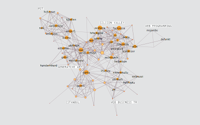
week 1
It appears he was trying to figure out how connections might evolve and expand (or indeed contract) over time.
The above image (from his blog) shows his Twitter network during the start of the first week of his experiment. He mapped the connections between his friends and then broke people into 6 groups.
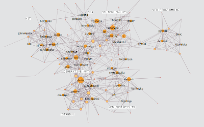
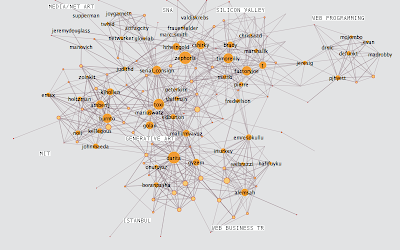
The next images show weeks 2 and 3:
Do people mind about these diagrams? It may reveal a lot about their privacy, which is potentially dangerous when you consider all the data is public.
I was thinking about carrying out a similar experiment with people within a work environment for the benefit of my research. Who talks to who in the office? In which way do they communicate (email, in person at the water cooler, telephone)?
Communication can be a problem in the office. Bottlenecks can be created; It is also known for people to communicate through email, even although they sit next to one another.
Where can ubiquitous computing come into all this? Can there be an invisible communication tool in the work place that can seamlessly fit into the daily rituals and lives of the employees?
It is naive and simplistic to consider ubiquitous computers will be adopted by people in any scenario. It's all about designing around the people.
No comments:
Post a Comment