Showing posts with label Visualization. Show all posts

Thursday, March 12, 2009

back of a digital napkin

SketchCast is based on an old principle: the improvised drawing on the back of a napkin in a bar, to sketch ideas and thoughts on paper to get a concept across another person. The website presents a new way to communicate "something" online by recording a sketch, with the option to overlay the animation with a voice or speech. Any sketch can be embedded on a blog or home page for later playback.


Can this be used as a storytelling method for designers? Or indeed, can it be used by users to communicate their ideas with designers?


Tuesday, March 3, 2009

unawareness to evolution

Introductions to new things, such as enhancements in technology, by chance, often deliver a more lasting memory or experience. 

I get, what I can only call "realization" moments when I haphazardly stumble upon something new.

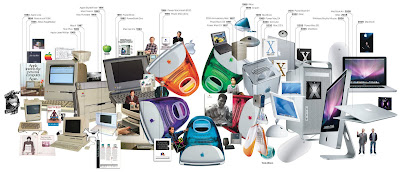
When I saw this image, I had one of those moments.


Wired have revealed a wonderful visual timeline showing the evolution of Apple products. 

Although I am aware of Apple's history and their legacy of products and services, this visualization made me realize not only how they have progressed over the past 25 years, but also how quickly.

This needn't apply solely to Apple. This image is testament to a changing world.

Context and cohesion: How can timelines be used as a communication visualization? What can they show? Can a storyboard be defined as a form of storyboard? 


Monday, March 2, 2009

NY Times Visualizations

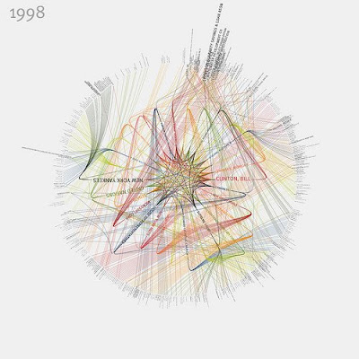
Visualizations that represent the people and organizations most mentioned in New York Times articles from 1984-2009 have been created by Jer Thorp. The visualizations show connections between the people and therefore relationships between them all.


twitter story

This communicates Twitter beautifully.

The simple hand-drawn graphics really reflect the simplicity and practicality of Twitter.


How can this method of story telling be used to communicate more complex information?

Follow me on Twitter: twitter.com/giorgio_giove


Friday, February 20, 2009

visualizing networks

Going back to my research into visualizing complex information; Burak Arikan, artist and researcher, studies the way people interact through communication.

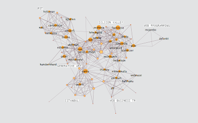
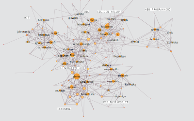
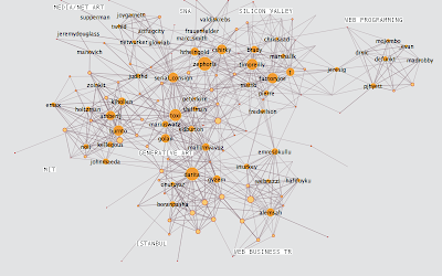
This following piece of work is wonderful. He carried out an experiment with the Twitter API where he analyzed the growth of his own network over a period of 3 weeks.

week 1

It appears he was trying to figure out how connections might evolve and expand (or indeed contract) over time.

The above image (from his blog) shows his Twitter network during the start of the first week of his experiment. He mapped the connections between his friends and then broke people into 6 groups.

The next images show weeks 2 and 3:


Do people mind about these diagrams? It may reveal a lot about their privacy, which is potentially dangerous when you consider all the data is public.

I was thinking about carrying out a similar experiment with people within a work environment for the benefit of my research. Who talks to who in the office? In which way do they communicate (email, in person at the water cooler, telephone)? 

Communication can be a problem in the office. Bottlenecks can be created; It is also known for people to communicate through email, even although they sit next to one another. 

Where can ubiquitous computing come into all this? Can there be an invisible communication tool in the work place that can seamlessly fit into the daily rituals and lives of the employees?

It is naive and simplistic to consider ubiquitous computers will be adopted by people in any scenario. It's all about designing around the people.


Thursday, February 19, 2009

richard harper

The down side to drafting into a word processing document and then copying/pasting into my blog is that sometimes I forget to actually copy and past into my blog! This following post has been sitting dormant in my computers hard drive... until now.

"
Professor Richard Harper from Microsoft Research, Cambridge, spent a morning with us to discuss how people of various disciplines see the world we live, and how this can cause problems in the design process.

He began by talking about how we gossip and how this act can be translated through metaphor into solutions for design problems.

I found this notion very refreshing as it coincides with work I have done in the past on touch-screen systems. My ideas for interactions were all based on human gestures I took as metaphors and used to act as inputs for computer systems. Richard calls this language (or method?) "Human Acts."

Richard's advice was to be aware of the difference between ourselves (designers) and others, such as scientists for example. Designers show their portfolios to other designers but seldom do they communicate their work from people outside of our discipline. He suggested we must have trust in other people and don't show them only the finished article. The process behind the finished article is often more interesting; so is communication of design all about telling a story rather than showing an artifact?

I agree with Richard. Whilst exhibiting my honours project work at the Degree Show and then New Designers, people were more interested in how the project materialized over time and why I made the decisions I did throughout the process. This was, at the time, a little disheartening in a way as I wanted people to be in awe over the prototype that I spent so long getting right. Instead, all they wanted to do was to ask questions and, I suppose, understand me rather than what I made. All I had to do was tell my story.
Richard Banks' advice is not to get to precious about prototyping; and this is probably the most valuable piece of wisdom I've taken on board since I started my Masters.

After spending an hour or so with Richard Harper, we were lucky enough to be invited to his evening lecture, entitles "Changing Humans." Here, he explained how the designers of computers and computer systems have changed their visions of users.

People love to gossip and communicate with each other. People network themselves naturally and now also digitally, through the introduction of text messaging and video messaging (and subsequently social networking sites like Facebook). The metaphor of gossiping is what inspired ideas such as video messaging; a tool that enables people to send friends videos, presumably to make them laugh.

The morning session and evening lecture made me think about a lot of things to do with common languages between people in different disciplines and interaction design in general. But the most valuable theory I took from today is all to do with language. Language is the key tool that we can use to communicate and be understood as designers. We can achieve this by applying metaphors and other language sub-tools. Language is the only common ground we all have.

"


Wednesday, February 18, 2009

how romantech

An example of personal technology?

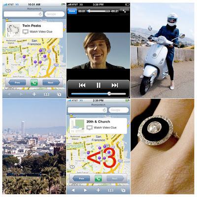
User interface designer Bryan Haggerty, programmer at LinkeIn, proposed to his girlfriend Jeannie Choe, former writer at Core77, with an iPhone application which he deigned himself.

It was last week that he popped the big question, but only after having his girlfriend guided through a route in San Francisco by the iPhone app. 

The app, which Haggerty calls "Romantech", displays a map containing location points throughout San Francisco. Each of the points in the map were tagged with a short video clip of Haggerty giving little clues of where Choe should travel to next. 


After a while, both met in a Park where all the points on the map connected to form the shape of a <3>

(The <3 is a heart symbol for those of you who don't know the lingo)>


Thursday, February 12, 2009

interactive comics and biological consideration

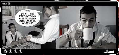
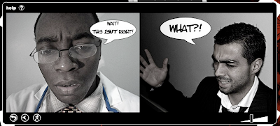
Dead On Arrival is an interactive comic loosely based on the story of the old 1940s film noir. 

Although I found this story rather dull, indolent and unexciting, the story was delivered clearly and the Flash interaction was well executed. This makes me think about communicating ideas to people through storyboards and story telling. 

I discussed with my study advisor, Dr Shaleph O'Neil about how people may react to certain storyboards. There will be 3 different types of storyboard: 1. Hand drawn 2. Graphically illustrated  and 3. Interactive.

The interactive storyboard will obviously be digital, however as Dead On Arrival shows, Flash animations can contain very "un-digital" and natural interactions. For example the turning of pages; this is done by clicking the top or bottom corners of a page and dragging them over, almost as you would do a book.

Computer interactions can be very natural. This reminds of the beauty of the interaction design of an iPhone or iPod Touch when zooming in and out of photos or web pages. Pinching your fore-finger and thumb together, a natural human gesture for describing the reduction in size of an object, is how to zoom out (i.e. to make smaller), and vice-versa.

How natural can I design interactions?

I don't mean to compare an iPhone with a digital comic, however the principle of their interactions are comparable in terms of natural gesture. There is biological consideration into their design. 

Click here to see the Dead on Arrival comic. An HTML version of the comic is also available, which I think is rather pointless. The whole beauty of the story is the interaction itself.

Monday, February 9, 2009

catch up

I identified the problem of communication of ideas in the design process to users (I don’t like using this word as it suggests a stereotype of certain people).

Communicating and prototyping ideas of interactions or, more complexly, of ubiquitous computing can be difficult and very time consuming.

But what is the value of prototyping? Is this immeasurable?

Richard Banks mentioned at his talk to IPD in November that a mistake would be to “get precious” about your prototyping. Rather than spending time on a final, well-finished product, it is often more rewarding and efficient to work through ideas quickly and communicating them as unfinished ideas as opposed to finished ones. Besides, most people are more interested in the process of a design rather than the outcome.

With Fable, I spent a lot of time neglecting people and working on making it work. Surely it should be the opposite?

However I did find it extremely difficult to communicate the ideas of ubiquitous computing to people during the project. When you tell someone a mug can be an input device to a smart-surface table, the immediate questions are always: why and how!

My initial aim, as discussed with Richard in August, was to develop tools and techniques to help designers communicate complex ideas within the interaction/ubiquitous computing design paradigm. Yet after some preliminary research, I have become clear that this is not necessary.

There already exists tools in which can be used to communicate and visualise ideas, such as storyboarding and paper-prototyping. I mean whatever happened to good old-fashioned drawing? Then there are animation software’s such as Flash which can be used to bring drawings and storyboards to life by applying movements, changes and communicating cause and effect.

“Faking” is also an unwritten method. A wonderful example being the Sketch-a-Move video by Anib Jane where she communicates the idea of controlling the behaviour of a toy car by drawing a path on its roof. No fancy electronics or computer programs, just smoke and mirrors (well, in this case a few magnets).

So I aim to put these traditional tools to the test and use them in new ways.

This happens to blend in nicely with another project I’m working on at the moment; the T3 project.

T3 (Transferability 3) is a joint research project between Deutsche Telekom Laboratories (t-labs), Berlin and the School of Design University of Dundee, exploring case transfer as a method to develop new designs for information communication products and services for older people.

Although only 2 weeks old, the project overlaps with some of the work I am doing in that it is very people-centered yet probably more demographically focused. “Older people” are seen to be 60 and over (still a huge demographic; there are more “older people” than ever before and this trend continues to rise).

Wednesday, February 4, 2009

Still Frames

It's been a (quick) month since my last post. I think I'm getting lazy.

Having spoken to my study advisor, Dr Shaleph O'Neil, on Monday, I remembered a short film I made last year. 

I took a series of photos (one every 5 minutes or so) from the exact same position when we were building our stand at New Designers 08 in London. 


An interesting way to approach visual communication of a process. Still framing could be used to communicate interaction design concepts? No fancy/expensive equipment needed; cheap tripod, digital stills camera. No script or thorough planning required.

Saturday, January 3, 2009

unique perception

Notes to self:

Can
storyboards be produced using images alone; without the use of written language?

Roland Barthes in his essay "Rhetoric of the Image" (cir. 1964) argues that the meaning of an image is always related to and dependent on verbal text. He believes that images alone are "polysemous." In other words, too open for interpretation.

Does written language always have to rescue an image?

The definition of 'comics' suggests that written language is not necessary to accompany an image or sequence of images. (For sure, a comic and a storyboard are not the same form of visual communication, however they do have their similarities).

A visualization can be interpreted in different ways depending on the opinion/stand-point of the viewer. 'Similar Diversity' (below) is a wonderful example of this.

But isn't that the beauty of visual arts? Our eyes see the same things our minds interpret things differently. 

Tuesday, December 30, 2008

so to sum up...

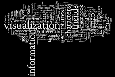
To recapitulate my research over the past semester of my MDes, I feel almost obliged to visualize it! 

I planned on writing a quick program in Processing that would randomly pick words from my blog and display them on an 8x5 sized postcard, and then I realised how pointlessly time consuming that would. I almost forgot about Wordle!

I don't know what I like best this; "information" which happens to represent a tree trunk, or the most important word of all, visualization, which sits proudly in the epicenter of my thoughts. 


Happy New Year!


religion, meet science


Philipp Steinweber and Andreas Koller have created Similar Diversity, a visualization that exposes a fresh perspective on the topic of religion and faith.

The graphic focuses on the Holy Books of five religions from around the world, showing communalities and differences between them.

The essence of the visualization is an objective and honest “text analysis” of the five scriptures without any manipulation from Steinweber or Koller, which are realized with 2 different tools; the evaluation is done using VVVV and the graphic visualization of the data is created in Processing.

Steinweber and Koller downloaded digital versions of English translated Holy Scriptures (Christianity, Islam, Hinduism, Buddhism and Judaism) from the internet.

The large arc visual shows the 41 most frequent characters from different Holy Scriptures and their communalities. 
The characters are aligned alphabetically on the x-axis. Their names’ and the arcs’ size are calculated from their total word-count in all 5 scriptures. According to that, characters which play a big role in several scriptures are displayed larger.


Below the names can be found bar charts which are breaking down the activities of the characters in detail. The verbs are gained by filtering them out of the texts, technically each verb straight after a character’s name is taken. In case of the word order "God loves" the verb "loves" is referred to the character’s name "God". The height of the rows and the font size show the frequency of particular activities.

What I love most about Similar Diversity, aside its beauty, is the fact that neither author manipulated any of the data from the scriptures, meaning the visualization will effect people differently on an emotional level depending on their religious standpoint. It really made me think about my preconceptions of religion, and in a time of conflict between Israel and Gaza, I Similar Diversity inspired me to think about religious conflict and realize to a certain extent why such hostility remains in existence.

Monday, December 29, 2008

visualizing fetishism


I mentioned in a previous post that people who are able to visualize complex information are normally and rightly given credit. Harry Beck, Ivan Kozik, Massimo Vignelli etc...

However after writing about the work of Sebastian Van Sande and Ivan Kozik and their Facebook visualizers, I began to question the reason for such systems. After all, do we really need to a graphic representation of our social networks? 

Where can I, as a post-graduate researcher, draw the line when it comes to a purposeful visualization (a subway map) and and a seemingly pointless one? 

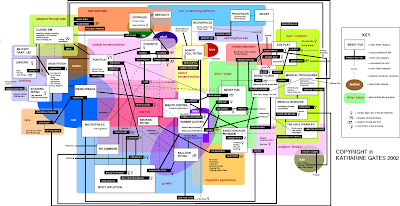
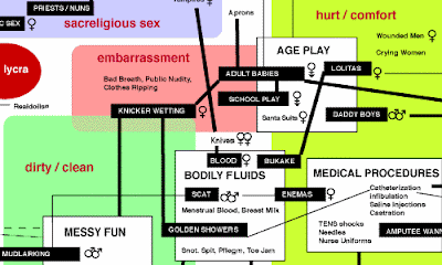
And then I found this map by Katherine Gates.

This is a "Fetish Roadmap" (for larger image click here). 

The Fetish Roadmap is a an overview and field guide to fetishes. The map provides overviews of general categories and descriptions of the sub-categories. The map is particularly well designed in that it depends on the viewers subjective point of view to understand and unravel the complexity of the information. 


I'm beginning to connect with what Livett (co-author of Freakonomics; see below) says differently. There is so much "information" (data) around us and as the world grows, more information comes to fruition. Levitt has proved that by looking at information, in his case "data", differently, we can begin to see our world in a completely new way and understand the true roots of problems.

Visualization is merely a tool for "seeing this new information in a new way," allowing us to think about new everyday things such as social networks differently.


Wednesday, December 24, 2008

visualizing friend networks

Sebastian Van Sande has developed Visualizera tool that allows you to explore your Facebook social network graphically. This is the "Visualization" of my Facebook account.

It's great as I can see friends connected to other friends and also the ones who are only connected to me. The tool allows for filtering your network by gender and relationship status.

However I'm confused as to the length of the connecting lines. What do different line lengths represent? Some of my close friends appear close to me on the map, and others far away. Does the program determine who is close and who is further away through a friends activity?

It would be even more useful if short lines represented close friends and vic-versa. This way, we would be able to visualize not only our map of friends, but also the various levels of relationships between each other. 

Imagine if we were able to connect our maps with each others! If everyone on Facebook did this then I would inevitably be connected to, say, Barrack Obama (presumably through 6 corresponding people considering the "6 degrees of separation" theory to be accurate).

Wouldn't it be great to see a whole world networked graphically using a social networking site?

As a visualization tool, Van Sande has created an interactive application that communicates a complex network greatly. As with the underground maps, credit is given to those who achieve simplistic communication of labyrinth-like infrastructures.

However in comparison to Nexus by Ivan Kozik (Below), Visualizer is lacking as both an interactive and informative tool for the search for information within a complex infrastructure. 

Nexus is another friend grapher for Facebook. It calculates friend similarity by parsing profiles, and highlights links between friends who share interests and groups. The visualization resembles a costilation and looks far more striking than Visualizer. 

And the method of retrieving information is far more straight forward. Another great example of a "walk up and use system."

Tuesday, December 23, 2008

Subway Map (Re)design


Above: The Tokyo Subway Map.

Not being fluent in Japanese, it must be said, I find this map very confusing however I assume that for a resident of Japan, it must be easy to understand. I make this assumption because the above map follows all the rules laid down by Harry Beck in 1933 and followed by Massimo Vignelli in 1972; The various lines are represented by different colours; the lines are all at 45 or 90 degrees; each station is represented by a box (rather than a circle, presumably to accommodate the form of the Japanese symbols); and the appropriate geographical liberties have been taken.

Are these the unwritten rules of railway map design?

Korean designers Kim Ji-Hwan and Jin Sol plan on redesigning underground maps from around the world starting with Tokyo, Seoul and Osaka. According to them, each cities subway and railway structures should reflect the character of that city in some way.

The above image shows the intricate network of Tokyo's subway, lightrail and monorail with over 1500 stations covering the metropolitan area.  The centre of this map has the Imperial Palace, and the subway lines circumvent the grounds that surround (are claimed by) it. This characteristic is visualized in this map by the concentric circles spreading outwards through the city. This representation of circles is suggestive of the Japanese national flag and the subsequent Japanese identity expressed in the flag. 

I think it looks great, yet I can't help but wonder if a stronger suggestive visual effect could be achieved if the map was made white. I'll do a bit of photoshopping on this one I think, I'm too curious.

White background. Is this another unwritten golden rule of map visualizations? 

Monday, December 22, 2008

New York Subway (a comparison)

Further to my obsession of the London Underground, I thought it would make sense to have a look at how other underground networks from around the word have been visualized.

In 1972, Italian designer Massimo Vignelli re-designed George Solomon's New York Subway map; and I think it is a fantastic piece of work. 


All the lines are represented by different colours, and each station represented by a black dot. In contrast to the original map design, the visual problem of awkward angles of the lines was solved by making each line 45 0r 90 degrees. Although this simplifies the map immensely, an obvious number of geographical liberties had to be taken. For example the map shows Central Park as a square rather than a rectangle.

However I do not see this as a problem. The aim of any map is to provide information in a way that is simple to understand/read. Re-proportioning certain geographical aspects of the map would certainly be detrimental to this objective. 

Do you spot a resemblance in this map? 

Obviously Vignelli was inspired by Harry Beck's design of the London Underground map (1933). Beck was the one who made all lines 45 and 90 degrees; and more importantly made the map a representation of the underground infrastructure, not influenced by the geographical layout of London itself. 

This makes me think about how visualization works. Do aspects of a design/map/flow chart etc need to be neglected in order to achieve ultimate simplicity?

Saturday, December 20, 2008

Freakonomics


I thought economics was about price elasticities, interest rates and diminishing marginal utilities. Then I read Freakonomics.

Authors Levitt ("rogue" economist) and Dubner (journalist) stray far from my perceptions of economics in search for solutions for some interesting (and extremely varied) questions. How do parents of different races choose names for their children? What sort of contestants on "The Weakest Link" are most likely to be discriminated by fellow competitors? And, my personal favourite, "If crack dealers make so much money, why do they still live with their mothers?"

Not the questions I'd expect an economist to ask. Yet Levitt insists that these enigmas are fair game for any economist as their solution involves understanding how people react to incentives.

What unites all these stories is a belief that the modern world is not impenetrable, is not unknowable and unpredictable, and "if the right questions are asked" is even more intriguing than we think. All it takes is a new way of looking. Levitt shows how to see through all the clutter.

Freakonomics is about "unconventional wisdom", using the raw data of economics in imaginative ways to ask clever and diverting questions. It makes me think about my area of research in visualization in that Levitt asks a question, takes the relevant raw data of economics, processes it and then articulates his solution to the wider audience through words.

Levitt has re-designed the stereotypical boring economist. 


Friday, December 19, 2008

communicating complex (or simple) information


We have an overwhelming amount of information all around us. We can see it and we can understand it, however one of the greatest challenges for a designer is to make sense of this information.

Don't take the word "information" too literally. Bear in mind that everything around us contains an element of information for us to interpret. For example, a ball has affordance in that it sends a visual clue as to how it should be used. We know to bounce, throw or kick a ball; and we know not to eat it!

Some information is often difficult to communicate to others. This hypothesis is something I have began to expand on in my area of research for my Master of Design degree. How can designers be good "Visualization Artists?"

It has proved useful to me in the past to be able to articulate my ideas/thoughts/research to others through giving examples. For this example, I'd like to write about one of most fascinating visualizations of complex information from one of my favourite cities, London. 

The London Underground has 11 lines and 268 stations. Approximately 4.25 million people use the underground everyday. 

The sheer complexity of the infrastructure of lines and stations was simplified beautifully by Harry Beck, an engineering draughtsman, in 1933. The London Underground map a perfect example of great "visualization" as it demonstrates how complicated information (the line and station infrastructure) can be communicated in a graphic language (a map) that is both easy to understand and remember. 


Over the festive season I plan on taking a little break from my studies, but I will be keeping my mind active by reading a few books on the topic of visualization:

Kress, G (2006) Reading Images: The Grammar of Visual Language. Routledge, London.
McCloud, S (1993) Understanding Comics: The Invisible Art. Kitchen Sink Press, New York, NY.
Carroll, J (2002) Usability Engineering. Scenario-Based Development of Human-Computer Interaction. Kaufmann Publishers, San Francisco, CA.
Kim, S (2004) VizAbility: Learn to Communicate Visually. Course Technology, Boston, MA.